Problem
Gravon builds personalised, risk-profiled investment plans for the Pakistan Stock Exchange. Its users come in two very different shapes.
A new investor wants to be told what to do. Too many choices, and they freeze. An experienced investor already picks stocks. Hold their hand, and they leave.
Building two apps would split the product, the design system and the roadmap in half. Building one app for "everyone" would fit nobody.
Context
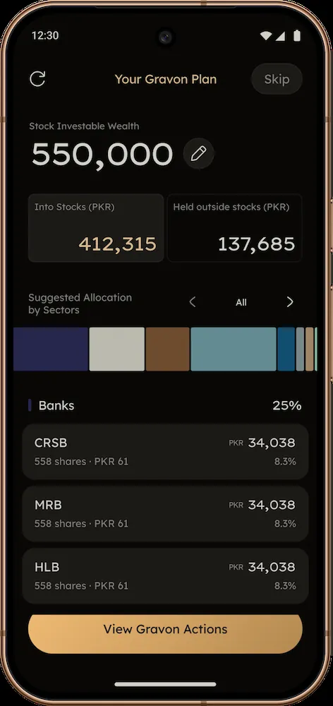
Gravon is an investment advisory app that generates self-evolving investment plans tailored to each user's profile. It recommends a portfolio, suggests the actions to get there, and recalculates the plan as the portfolio changes. Mobile only.
I designed the product in Figma end to end, from onboarding and the profile quiz to the plan, portfolio, insights and the design system behind them, working with a collaborator on the product side.
What I did
I kept segmentation to a single axis, and I made the user choose it.
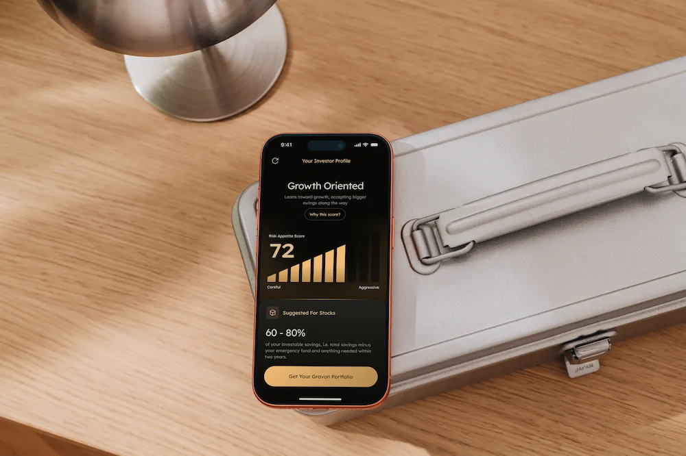
The profile quiz ends with one question: how hands-on do you want to be?
- "Guide me all the way" → New Investor. Full guidance, no stock picking.
- "I pick stocks too" → Expert. Hands-on control, plus an Explore tab with trading signals and screeners.
Everything else in the quiz (risk, amount, Shariah preference) shapes the plan. This one answer shapes the app.
Then I designed the app as a common experience with two branches instead of two products:
- Shared: sign-up, the profile quiz, the Investor Profile, account and settings.
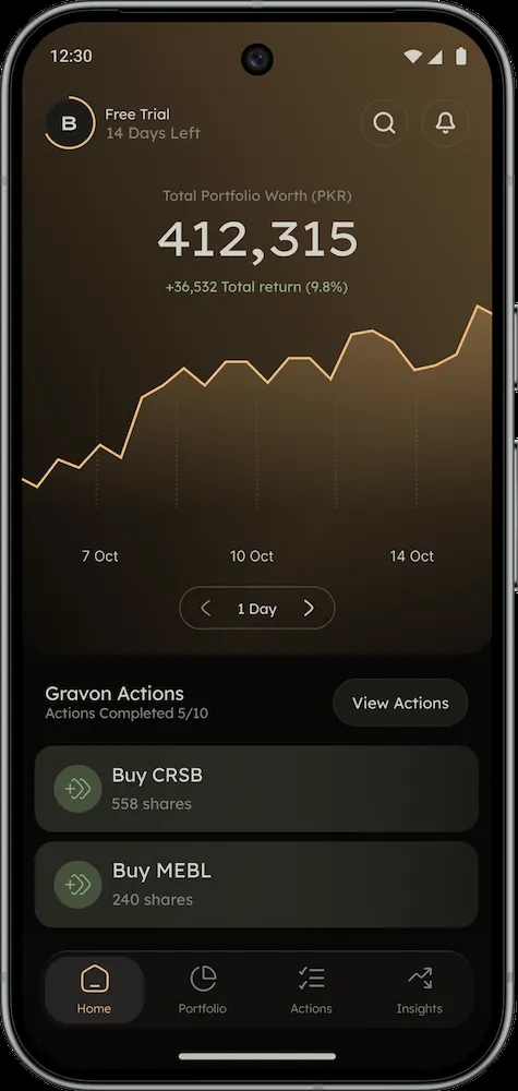
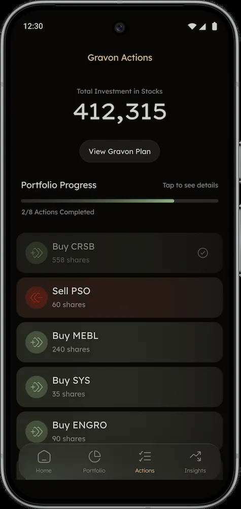
- New Investor: a home built around the next action, the Gravon Plan, and a step-by-step Actions list ("Buy CRSB", "Sell PSO", and so on) with progress.
- Expert: an existing-portfolio upload (PSX ledger), a Portfolio Check Up, deeper Insights and Risk views, and Explore.
Even the wording adapts. In the quiz, a new investor is asked "How much do you plan to put into stocks?" while an expert is asked about the size of the portfolio they already have.
Solution
One app, one design system, two experiences.
- The same bottom navigation for everyone: Home, Portfolio, Actions, Insights, with Explore added for experts only.
- The same components, with each screen designed in a New Investor and an Expert version where the needs differ.
- A switch in Account → App Experience, so a new investor who grows into an expert can change their guidance level without starting over.
Why it worked / what I'd do next
A single, user-chosen axis kept the product honest. Nobody gets labelled by an algorithm; they tell us how they want to invest, and they can change their mind. It also kept the build manageable: one design system and one navigation model, with differences only where they earn their place.
Gravon had not launched in the material this case study is based on, so there are no results to report yet. Next, I would want to see how many new investors switch to Expert over time, and when. That is the signal for whether the guided path is teaching people or holding them back.